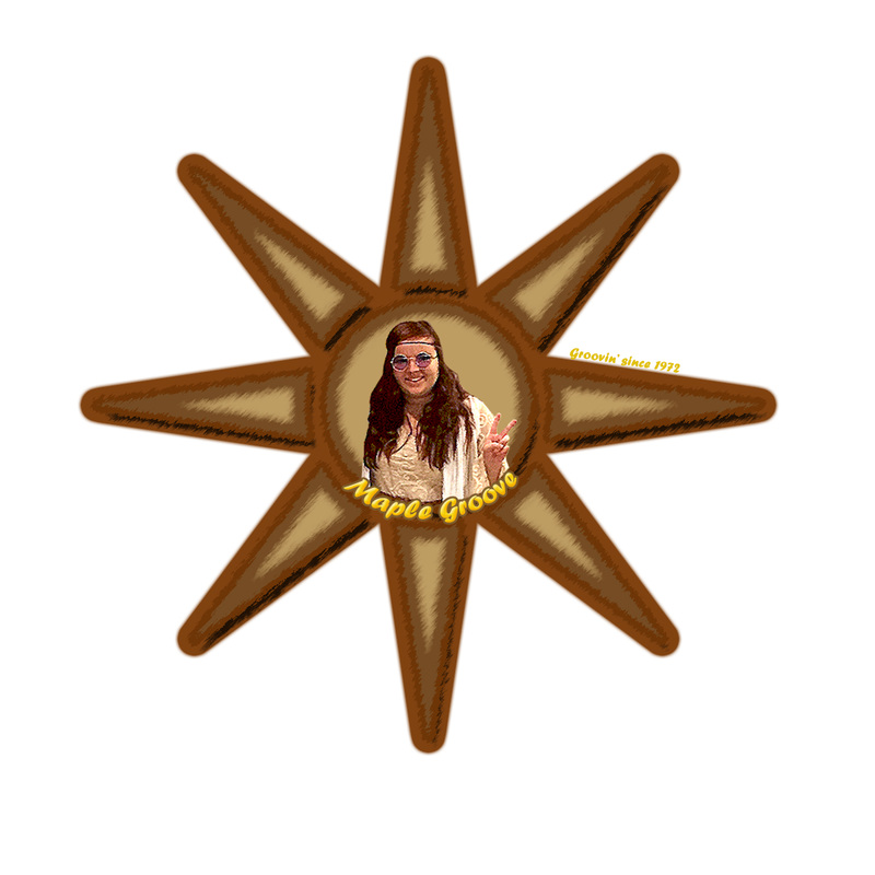
Syrup Logo
- What era does your logo represent? My logo represents the early 70s
- What design choices did you make to represent your era? (hair style, colors, fonts, prints or patterns, etc.) I chose to have a hippie mascot for the logo to fit the time period. I used a sun shape because sun's were a common hippie symbol.
- Are ALL logo project requirements fulfilled? (Edited photo, clipping mask, type on a bath, blending options, refine edge tool?) Yes
- What tools did you use and where? I used the clipping mask to put my mascot in the shape. I used blending options to give a syrupy texture to the sun. I used filters to get a vintage look to the logo.
- Is there anything you wish you could add or change to make the logo look more professional? What are some other tools or pieces that can be added to make the most of Photoshop tools? I wish I would have used a flower instead of a sun.
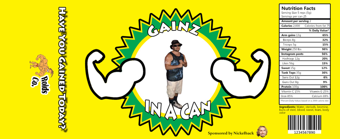
Can Label
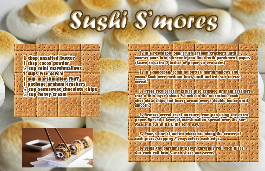
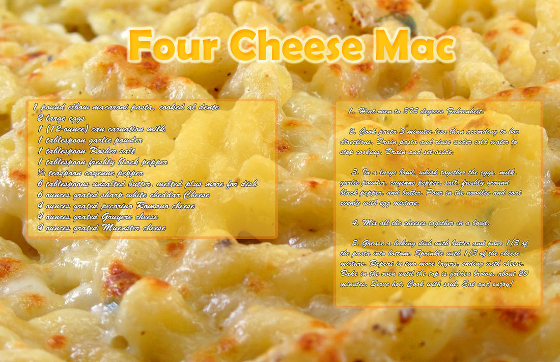
Recipes